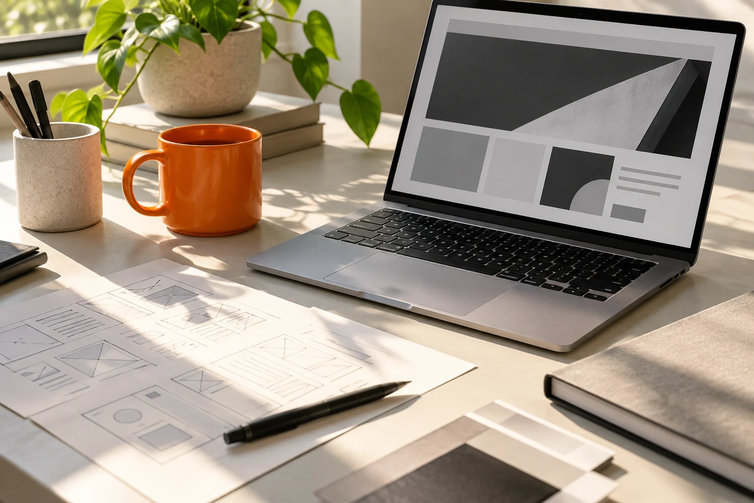
Services
Give each specialism its own image and a short, useful explanation.
A website should feel right and work well. We bring together expressive typography, clear structure and considered technology to create a useful home for your business.
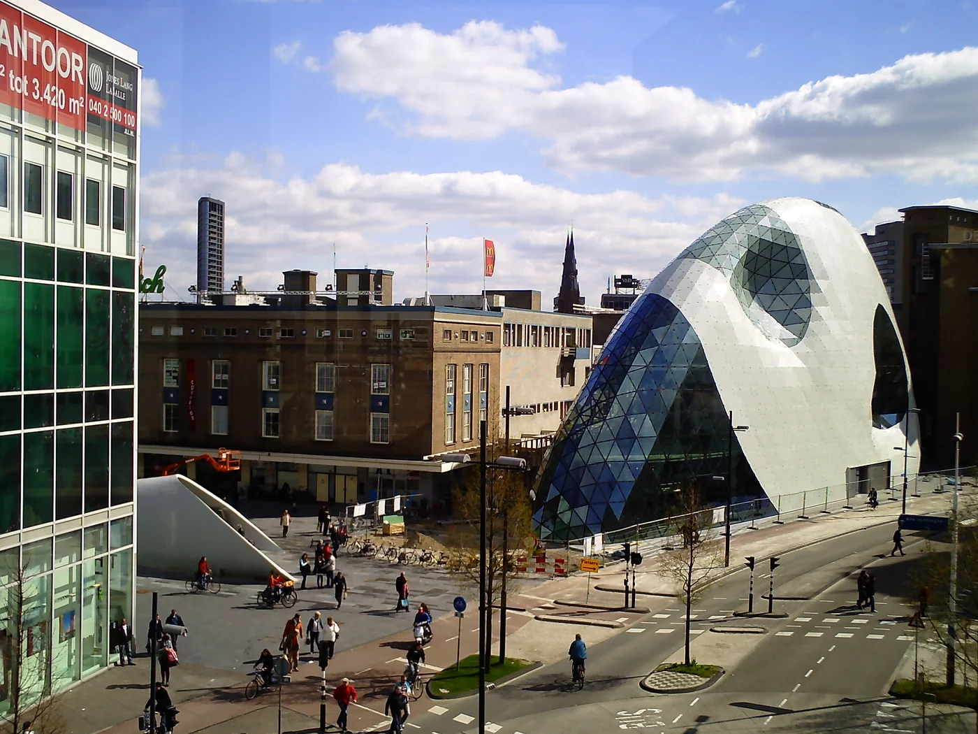
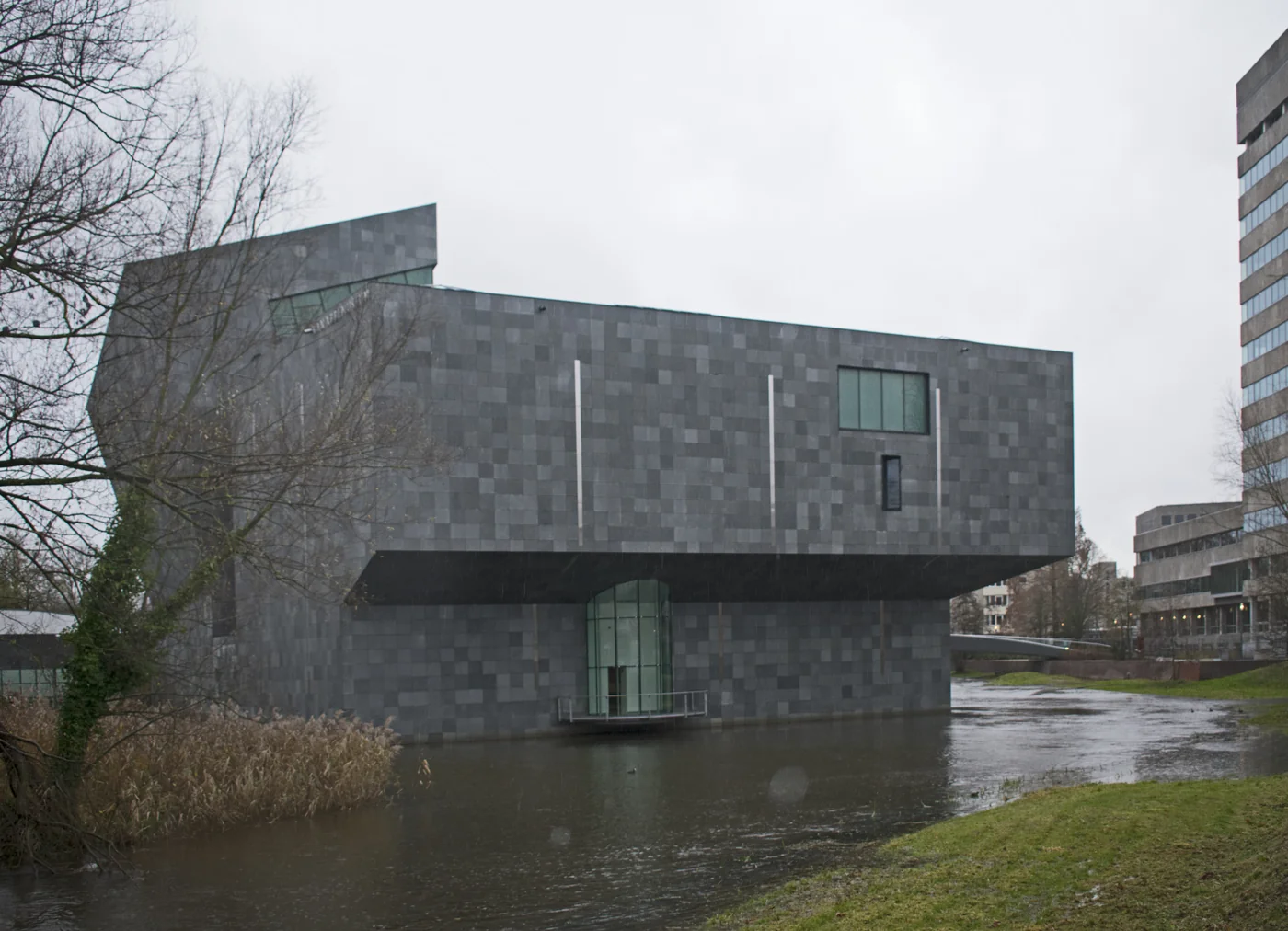
There are dozens of ways to combine cards, carousels, images and content blocks. Product imagery, teamwork and Eindhoven architecture show how a composition can adapt to your business. The order, colours, typography and photographs follow the story you want to tell.
Give each specialism its own image and a short, useful explanation.

Collections and categories that invite people to explore your catalogue.
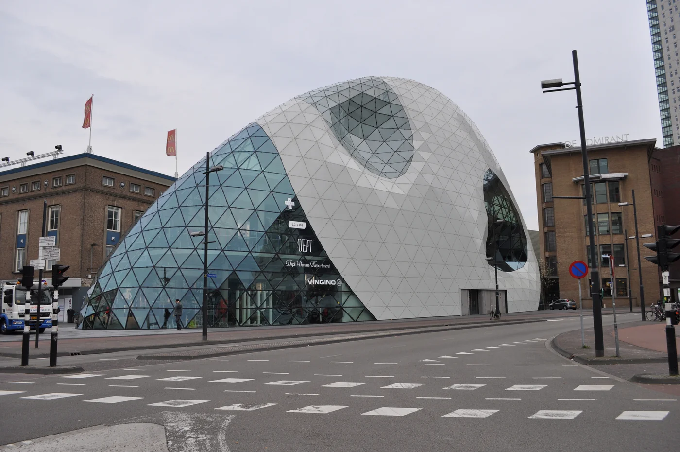
A visual selection that brings your key content into focus.
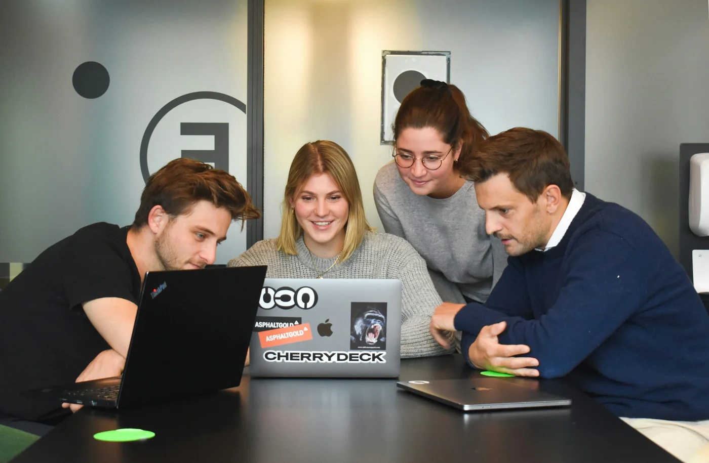
Introduce the people behind your business.

Blog posts arranged to make browsing and reading easier.
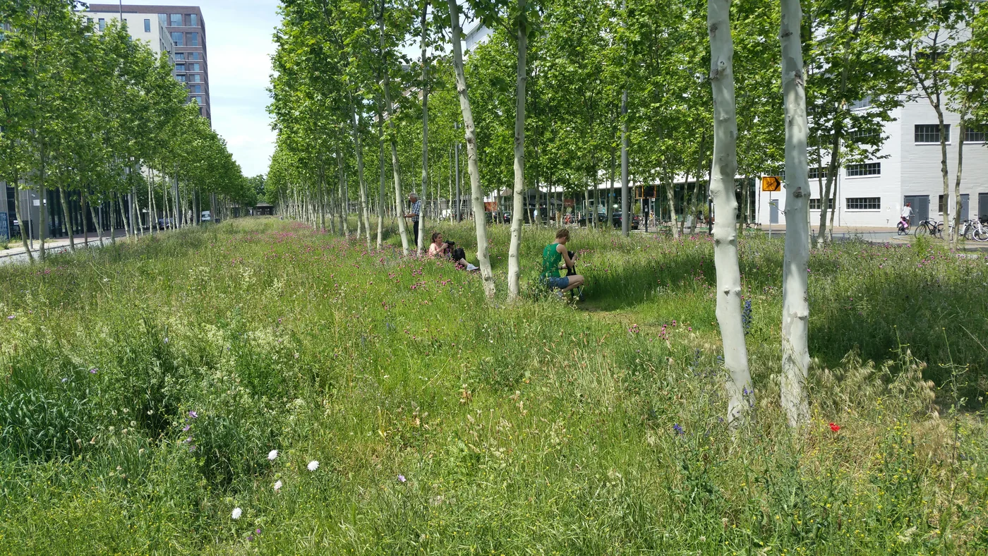
A portfolio that lets visitors appreciate your work at a glance.
The same content can tell a story, present a collection or make an image the main attraction. The composition changes; your brand keeps its character.
Try three compositions with the same content.
EditorialThe same information can take many forms. We choose the composition that makes your offer clear and give each block the space it needs.
Services and products
Content in sequence
Images with rhythm
Featured messages
A collage can bring together portrait photographs, smaller tiles and a prominent feature. Hover over the cards or focus them with your keyboard to see the movement.
A grid arranges images in rows and columns. It provides a clear structure for a catalogue, portfolio or gallery.
Images keep different heights and fit together asymmetrically, making good use of space. This works well for galleries, visual inspiration and varied collections.
A large lead story sits alongside smaller features at the top of a page. A useful format for news sites, magazines and updates.
ways to present your content
Cards with depth and horizontal movement. The following texts show possible uses for this module; customer reviews are added when genuine testimonials are available.
A real review can include a photograph, the customer’s name and the service they used.
Testimonials
1 / 4 · Customer reviews
Illustrative images. They do not depict our team or our own projects. Photographs have been resized and may be cropped to fit the composition.
We make the journey from question to action understandable. Navigation, hierarchy and interactions help people find their way without unnecessary steps.
We adapt content, images and controls for mobile, tablet and desktop, with attention to keyboard access and readability. A design should work across devices.
Search intent belongs at the beginning. We plan URLs, headings, internal links and the pages that deserve their own place before visual details take over.
Purposeful features, lightweight media, explicit image dimensions and stable layouts support the experience. We test where delays actually occur.
We identify existing strengths and points of friction. Important content, measurement and URLs are carried forward deliberately into the new design.
One clear message, relevant information and a logical next step. Each page responds to a specific audience, service or need.
Each language gets natural copy, its own metadata and suitable URLs. Language switching preserves the visitor’s current page and context.
Discuss the audience, goals and constraints.
Organise content and key visitor journeys.
Develop a visual direction and clear screens.
Build the agreed functionality.
Check content, usability and technology.
Publish and agree the next steps.